Zenklub: Optimizing the Scheduling Experience
Zenklub is a mental-health platform that connects users to therapists for online sessions. User research revealed that people struggled to compare professionals and feel confident in their choice. The redesign reduced friction in the therapist selection process to increase user engagement and retention.

About the Project
There was a problem with user engagement in sessions. Many users didn't schedule the first appointment, and many who did, didn't continue for the following ones. My goal was to identify the friction points in the scheduling flow and redesign the experience to build trust and simplify decision-making.
Challenge:
Zenklub faced a drop-off challenge: many users (B2B/B2C) reached the platform but never booked their first session.
My Role:
Product Designer (Discovery, UX/UI, Prototyping)
Goal:
Identify the friction points in the scheduling flow and redesign the experience to build trust and simplify decision-making.
The Success:
Validated redesign with zero critical navigation errors and high qualitative user confidence.
- For the user: An easier way to decide the best suitable specialist and schedule a therapy session.
- For the business: More users scheduling sessions and coming back for the next ones.
User Research
Interviews with b2b and b2c users (app & web) to identify behavior, frustrations, and feedback related to the entire scheduling process while they walk us through it (12 participants). We also Interviewed 5 professionals (therapists) to understand their relationship with patients and their behavior profile.
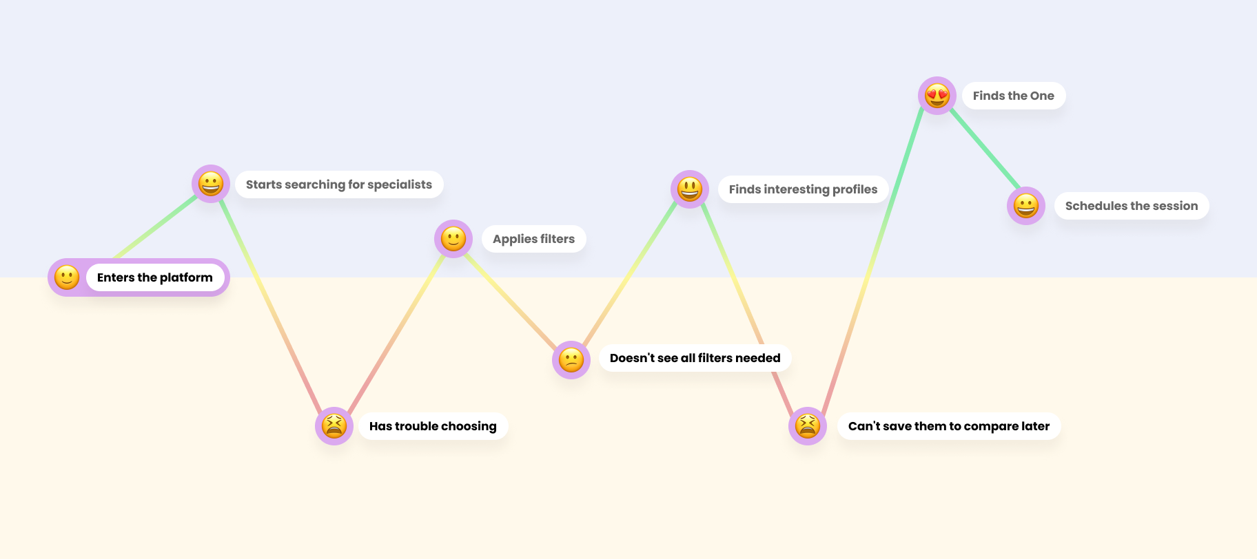
Users weren't just looking for "a doctor"; they were looking for a human connection.
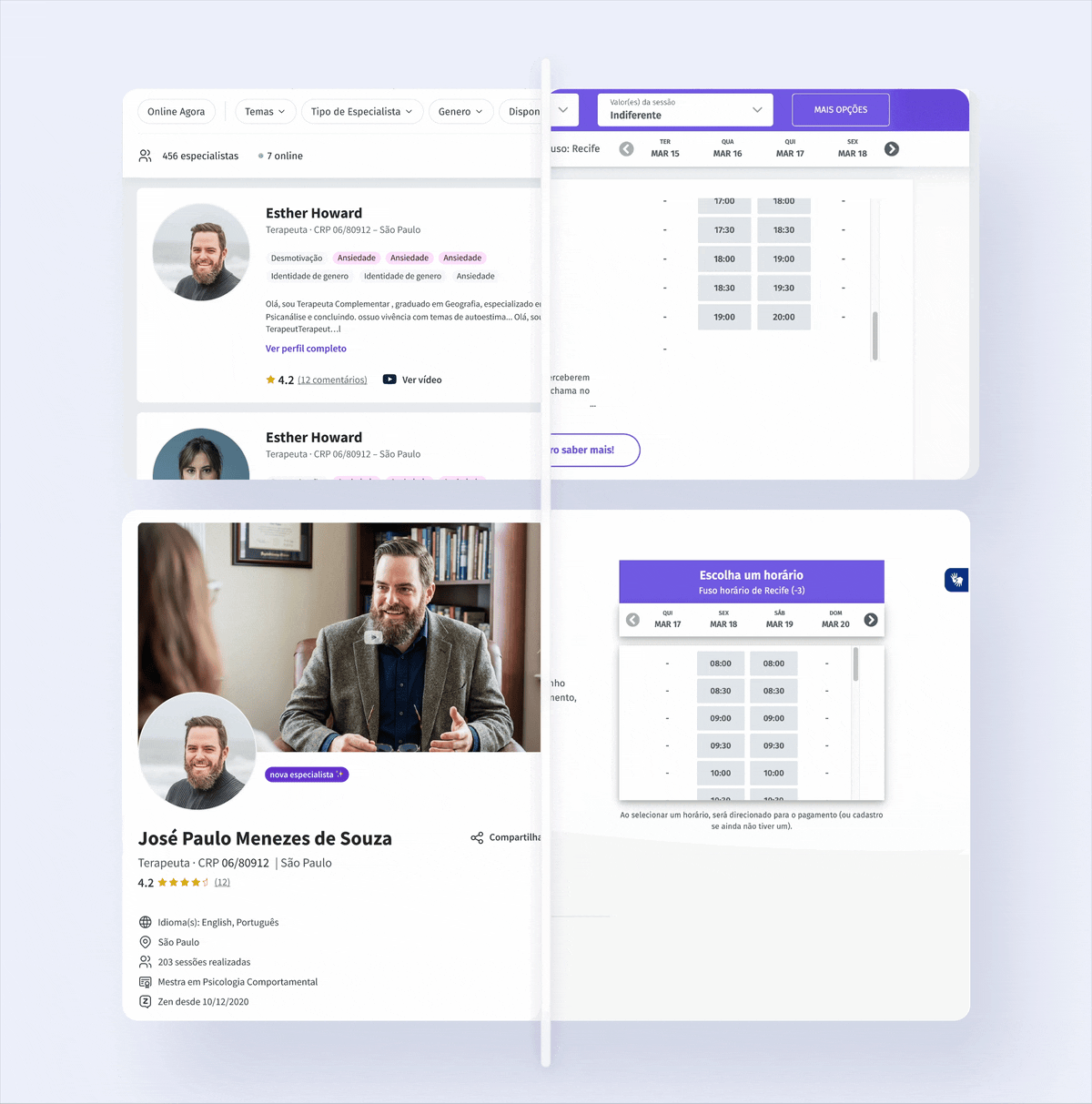
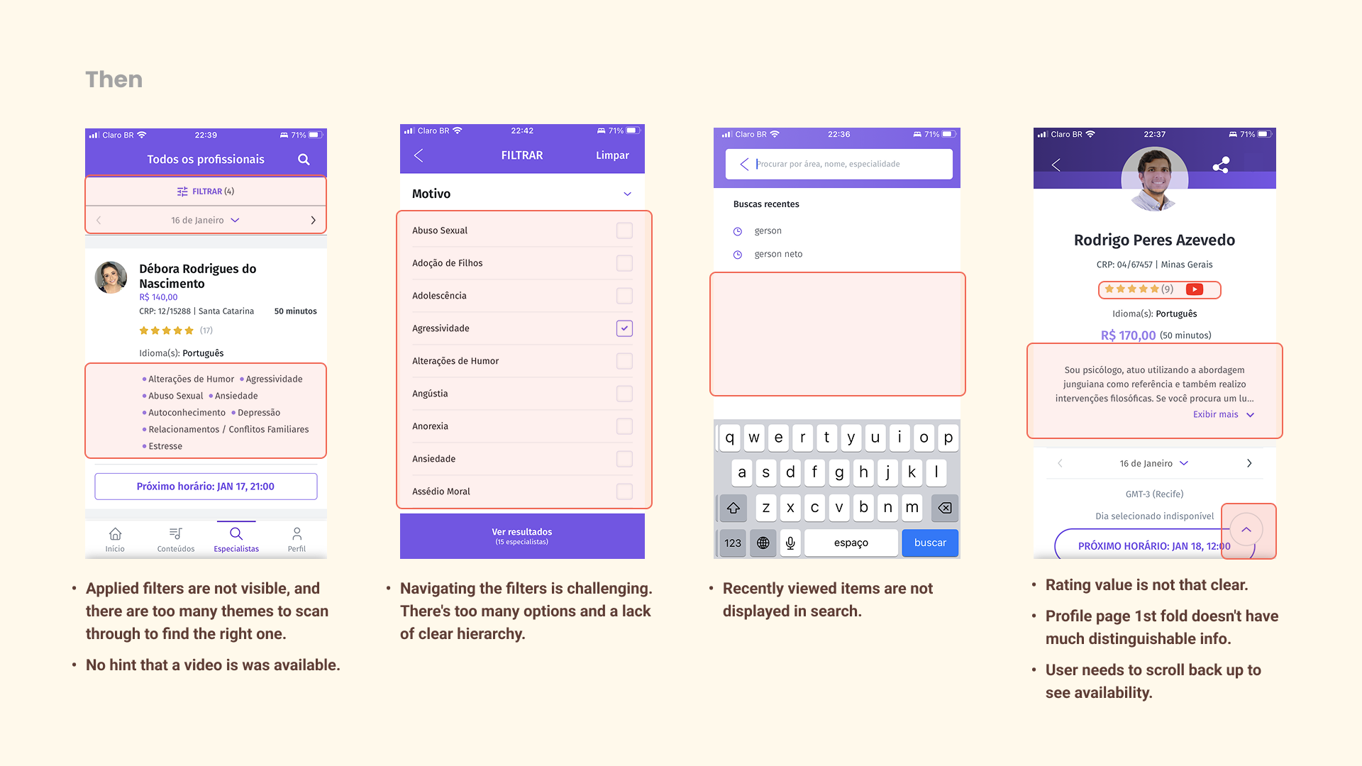
The Problem: The list was overwhelming, filtering didn't work as expected. Ratings without comments felt "fake," and the lack of video made the choice impersonal.
User Journey Map
Based on the interviews we identified the user journey and how they feel throughout the process of scheduling an appointment.
Strategic Solutions
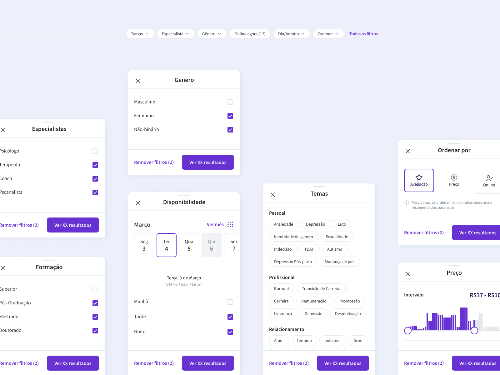
Decision-Making via "Chunking": Grouped filters by Personal, Professional, and Relationships to reduce cognitive load.
Human-First Profiles: Introduced embedded video intros and highlighted "Experience Tags" to allow quick scanning.
Contextual Validation: Shifted from "Simple Rating" to "Quantity + Content" of reviews to provide social proof.
Once we gathered all the insights we were able to map the opportunities identified alongside with stakeholders, and prioritize them based on how important it was for the user and how complex it was to build.
Searching for a specialist: It's important to have a record of the professionals of interest. Education level, gender, and age can be relevant criteria when choosing.
Filtering: Some filters are “hidden” and not used. It's important to be able to search for a specific timeframe.
Analyzing Profile: Professionals who have a video commenting on their approach are more attractive. Viewing and analyzing schedules is not practical (the day of the week is more important than the date).
Missing info: Personal information and experience are missed in the analysis of the professional profile.
Ratings: The rating itself is less relevant than the quantity and content of the comments. The amount of reviews serves as "validation". A more objective form of evaluation would facilitate comparison.
Reviewing: Some users don't review because they don't want to identify themselves. Most of them forget to leave a review.
With all the context established, we began the design phase building the wireframes for the main screens of the flow: Search List and Specialist Profile.

Refinements

Discarded
- Adding a second layer for the filter options was also an idea but it takes too much real state and may get confusing.
- Due to performance issues for this particular screen, we ended up getting rid of the video preview in the list page.
- Carousel list of days prove itself to be better than a calendar view.
Added
- In sorting, we added a disclaimer that the default sorting was already considering the best options.
- For no results cases, we added an easy way to simplify the filter and make sure some results are shown.
Search for especialists: Personalizing the specialist to build trust before the first session
Final Layouts


Before
- Overwhelming filter list and some ”hidden” ones
- Not clear what filters were currently applied
- No way to record the interesting specialists' profiles
- Too much scrolling to have a profile overview
- No clear scheduling CTA
- Hard to compare the ratings
- The video not catching the attention
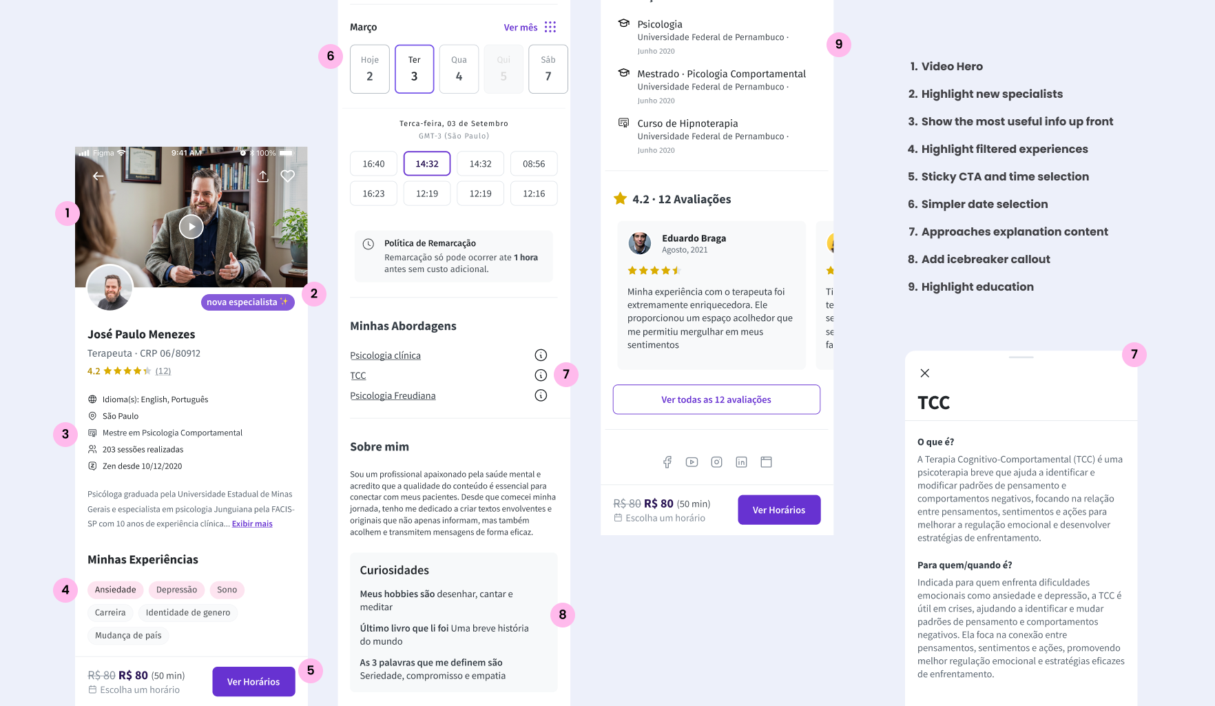
After
- Most used filters upfront (open one at a time); related filters chunks
- Highlight applied filters
- Add to favorites feature; Recently visited profiles on search
- Profile summary: most important topics listed upfront, more scannable
- Sticky CTA bar with schedule options
- Rating number is shown
- Embedded video on the profile page
Checkout

New:
- Enable users to share their profile (personal info) with the specialist when shchduling
- Allow connecting personal calendar to avoid forgeting about the session
Review

New:
- Allow anonymous review (checkbox)
- Add objective feedback (selection tags)
Strategic Impact and Human-Centered Outcomes
Bridging the Trust Gap: Research revealed that users weren't just looking for clinical credentials; they were seeking a human connection. I pioneered the Curiosities feature, a strategic callout where specialists answer preset personal questions (e.g., hobbies, last book read). This transformed the profile from a cold medical directory into a trust-building experience.
Execution Excellence: By introducing video intros and scannable "Experience Tags," we addressed the primary friction point in the scheduling funnel: decision paralysis.
Qualitative Success: Post-redesign usability tests showed zero critical navigation errors. Users reported higher confidence in choosing a specialist, specifically praising the new "Favorite" feature and the scannable profile layout.


