Active: Dynamic Interface for Undercover Operations
Active is an undercover operations app that provides real-time video, mapping, and tactical communication. The redesign focused on improving situational awareness and reducing cognitive load for the covert team following the mission. Post-release usage data showed that the new feature became the #1 most adopted, validating its operational impact.
Summary
Empowering undercover officers with real-time situational awareness.
The Challenge
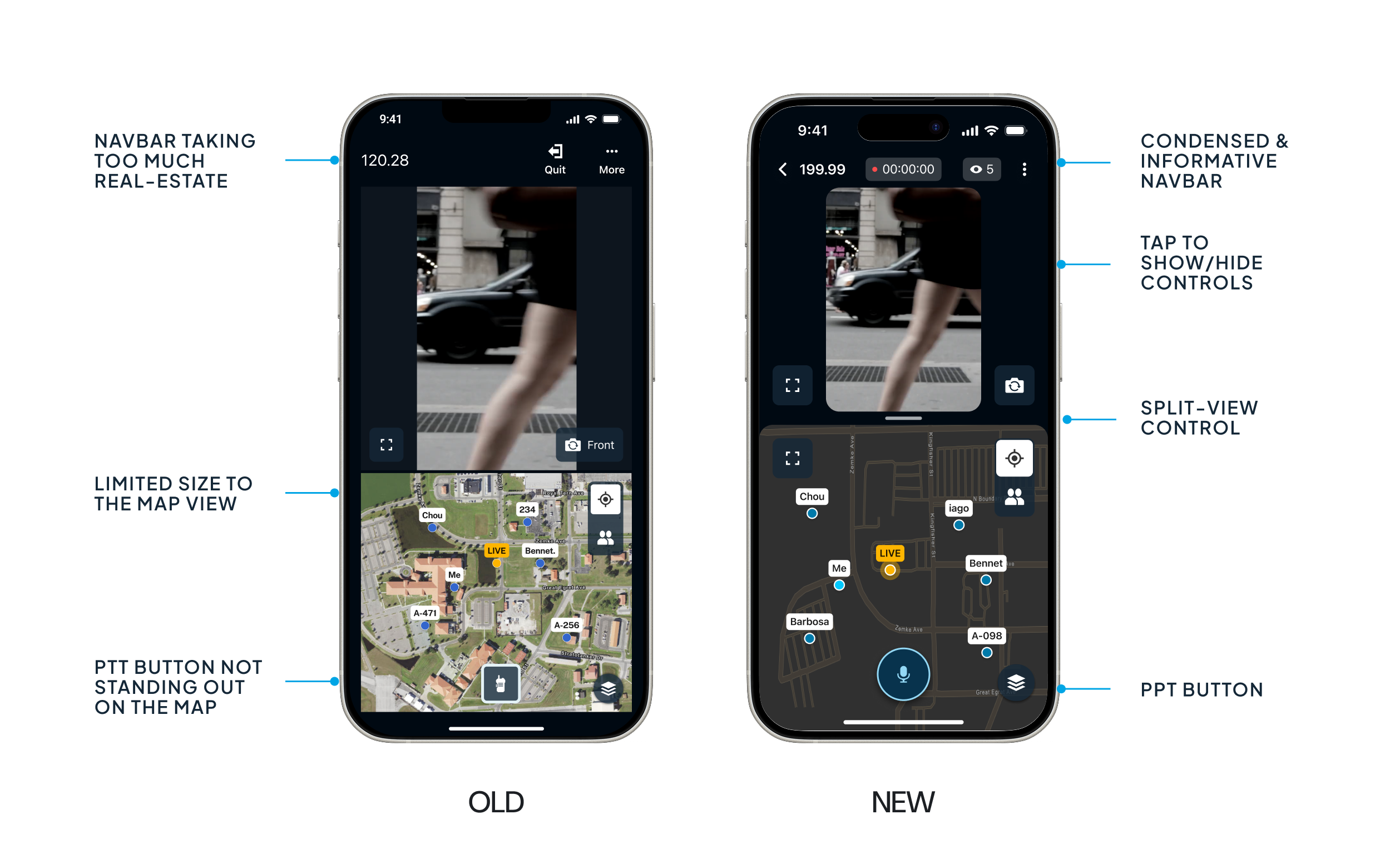
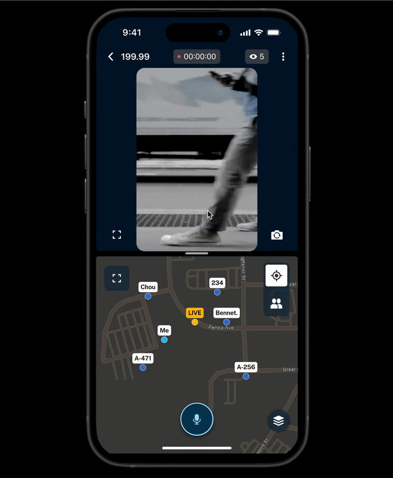
Undercover agents and monitoring teams relied on a rigid, fixed split-screen app. This hindered the visibility of detailed maps or video feeds during critical moments of high-stakes missions.
My Role
Sr Product Designer (Research, Prototyping, UI, and Testing).
The Strategic Solution
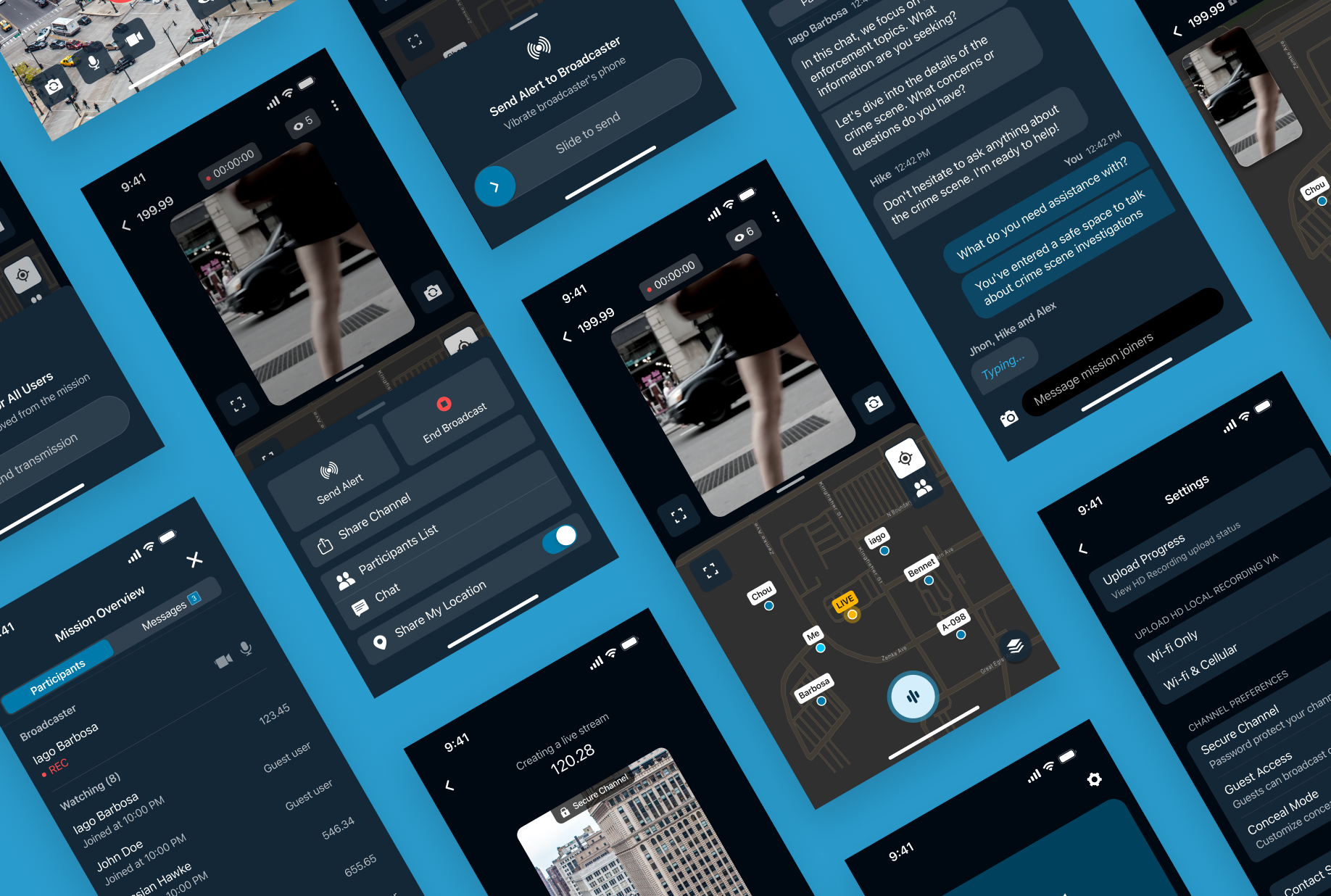
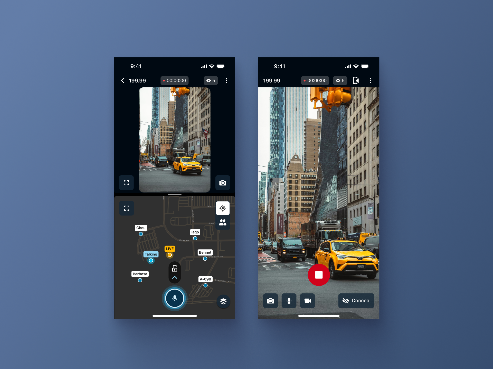
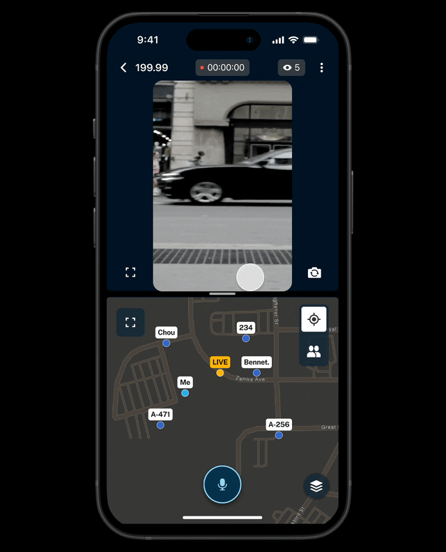
I replaced the static layout with a fluid, draggable divider. This allowed officers to shift focus instantly between video and map according to the mission's intensity. I also introduced a "Tap-to-Hide" pattern to maximize screen real estate by 40% during critical moments.
The Result
The new "Dynamic Screen Control" became the #1 most used feature in the entire application, proving that in mission-critical design, flexibility is the ultimate usability feature.
The Problem: Rigidity in Dynamic Situations
The app transmits audio, video, and location from agents in the field. The ecosystem serves two distinct users: the Broadcaster (undercover agent capturing evidence) and the Covert Team (monitoring remotely to ensure safety).
Through heuristic analysis and initial feedback, we identified that the previous app version forced the Covert Team to view the Map and Video in a fixed split. This design ignored the dynamic reality of the field:
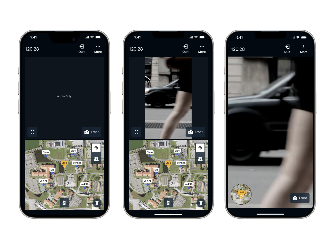
- Audio-Only Missions: When no video was available, the video container still occupied 50% of the screen with a black box, wasting valuable space that could be used for the tactical map.
- Critical Moments: Sometimes the map requires more focus. During visual identification, the video needs 100%. The interface did not allow for this rapid switching.
- Visual Clutter: Too many UI controls that were not always necessary.
"In a mission, every pixel of screen real estate matters. If an agent can't see the escape route on the map because the video is taking up space, safety is compromised."
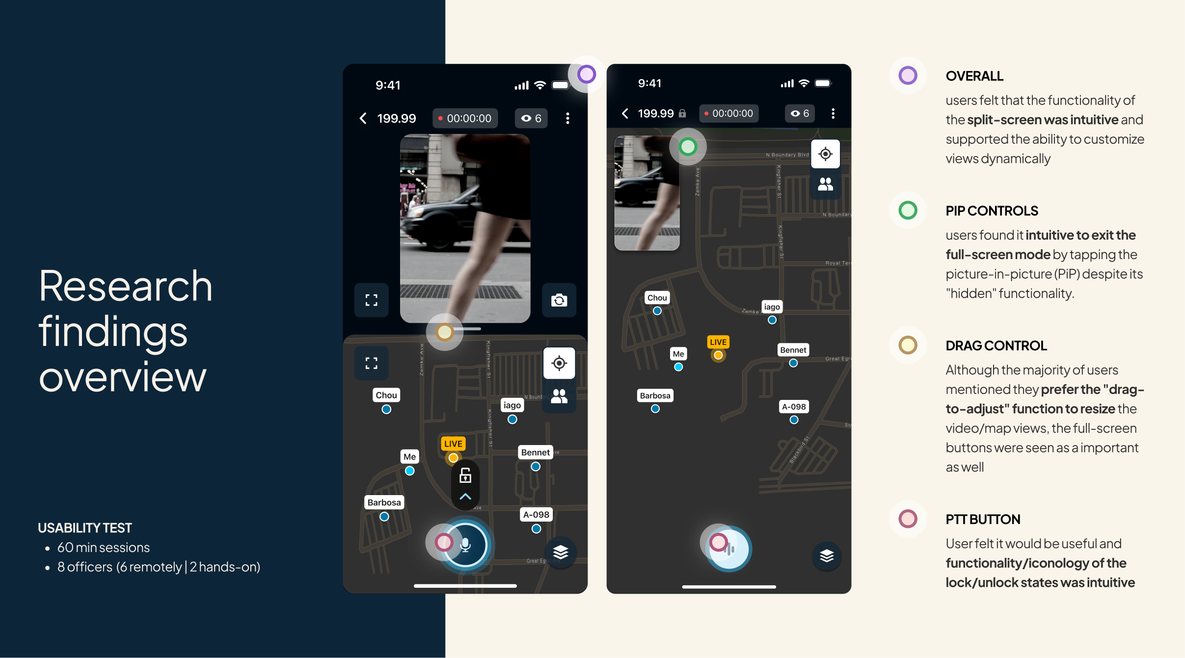
Research & Discovery
To validate our hypotheses, I partnered with a UX Researcher to structure the research plan and define the learning goals. The researcher facilitated the sessions and synthesized the findings into the final report.
- Methodology: 60-minute sessions with 8 officers experienced in undercover operations.
- Technique: In-depth interviews + Concept usability testing.
The Major Insight
We discovered the solution wasn't just "Full Screen" vs. "Split Screen." Agents needed granularity. Depending on the second of the mission, they might need 80% video focus and 20% map, or vice versa. Crucially, they wanted to adjust this in real-time without navigating through menus.
The Solution: Design for Total Control
Based on these insights, I developed three key interaction improvements:
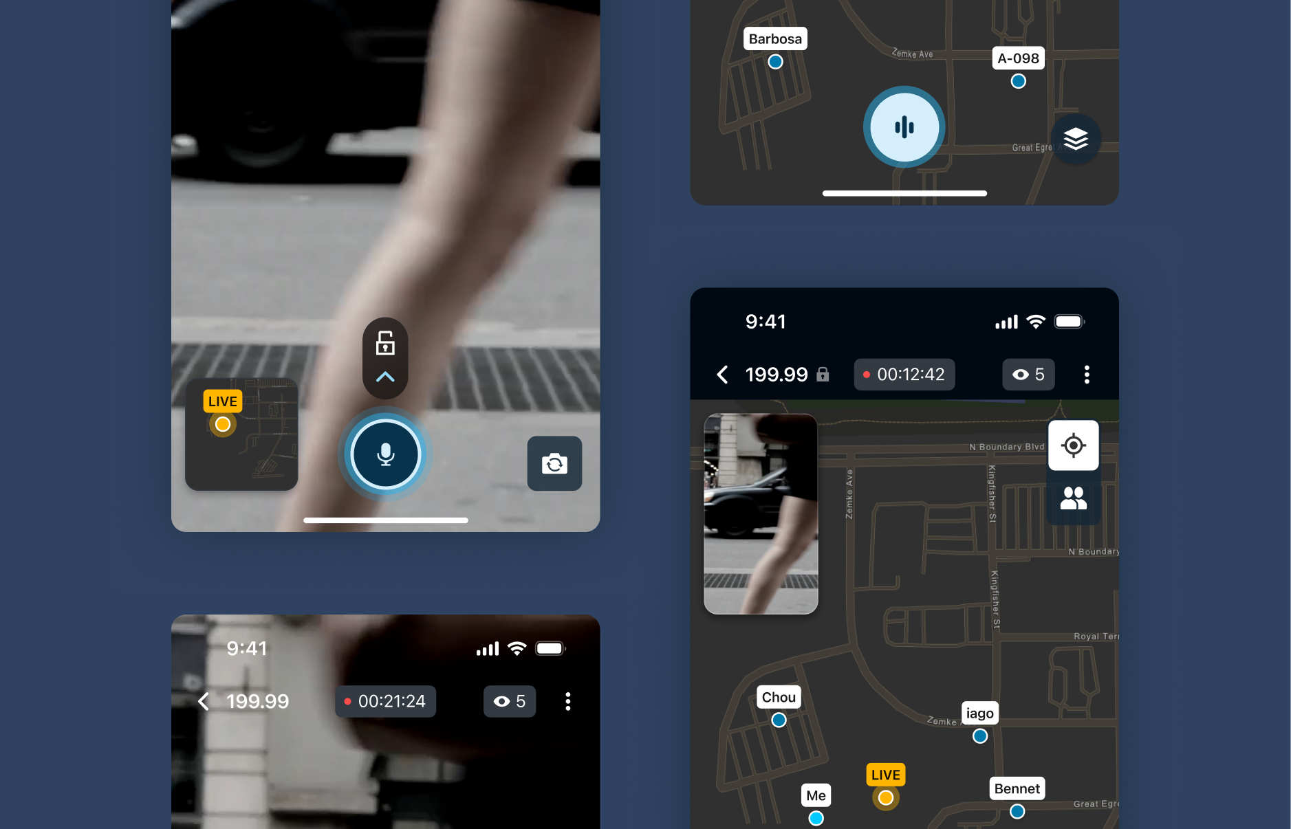
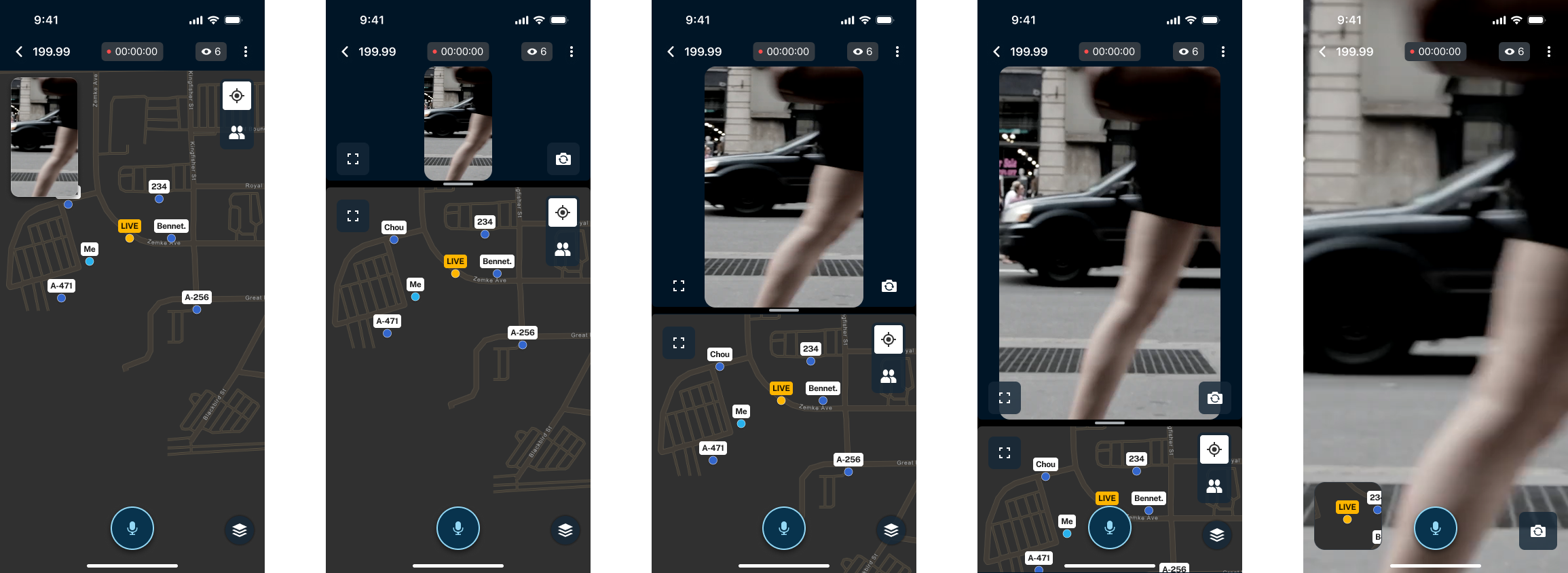
A. Dynamic Control (Drag-to-Adjust)
We replaced the fixed split with a fluid, adjustable bar.
- Design Decision: We initially tested "Snapping Points" (fixed buttons for 1/4, 1/2), but usability tests (see chart below) showed users rejected this. They preferred continuous dragging, which offered the precision required for tactical operations
B. Tap-to-Hide (Reducing Cognitive Load)
To maximize the visible area, we created a pattern where a single tap on the video hides the entire UI (buttons and menus).
- Result: The learning curve was minimal, users discovered the function almost immediately without a tutorial, allowing for total focus on the feed when necessary.
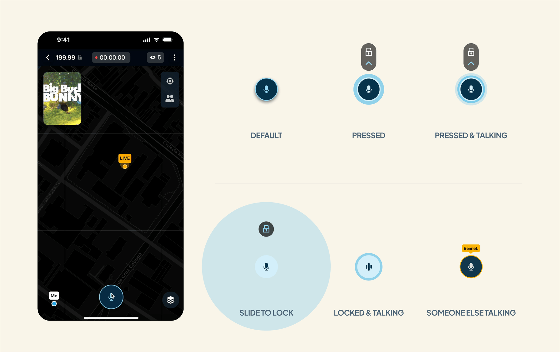
C. Integrated Communication (Push-to-Talk)
We integrated secure audio communication directly into the main monitoring screen with clear system states ("Locked/Hands-free" and "Pressed"), enabling tactical communication without losing sight of the target.
Results & Learnings
Guardian of the User Experience: During development, the team faced significant technical hurdles in implementing the fluid "Drag-to-Adjust" interaction and the complex multi-state PTT (Push-to-Talk) logic. I maintained the design vision, collaborating closely with engineering to ensure these mission-critical interactions were delivered without compromise.
Proven Adoption: By prioritizing operational flexibility over technical simplicity, I delivered a tool that empowers undercover agents to adapt their interface in real-time, reather than just providing full-screen buttons, directly enhancing situational awareness and officer safety in high-stakes environments.
Impact & Metrics (Pendo Data):
- Massive Adoption: "Split View - Drag and Drop" became the single most used interaction in the app, outperforming all other features.
- Speed of Adoption: The "Time to First Use" was only 2.2 days, indicating high intuitiveness and organic discovery of the PTT feature.
- Engagement: The video container became the second most clicked area, validating the need for the "Focus Mode" interaction.
Key Learning
In mission-critical products, flexibility is more valuable than over-simplicity. Empowering the user to adapt the interface to the context of the mission was the key factor in the project's success.